Cedar Rising
Dynamic affordable housing architecture welcomes residents home
Cedar Rising provides 82 affordable homes to the Aloha, Oregon area. Scott Edwards Architecture’s design includes dynamic massing and a simple material palette, creating a place with its own identity that still responds to the surrounding context of residential and commercial buildings. The development is a mix of studio, 1-, 2-, and 3- bedroom apartments, recognizing the need for a range of home sizes in this neighborhood. Resident amenities like a large community room with a communal kitchen and an outdoor courtyard with a play structure promote social connection and spending time outside, both important components of a design that is trauma-informed. The building also prioritizes sustainability and achieved Earth Advantage Platinum.
Client
BRIDGE Housing
Location
Aloha, OR
Size
78,000 sf
82 Apartments
Year
2024
Achievements
2024 Earth Advantage Platinum
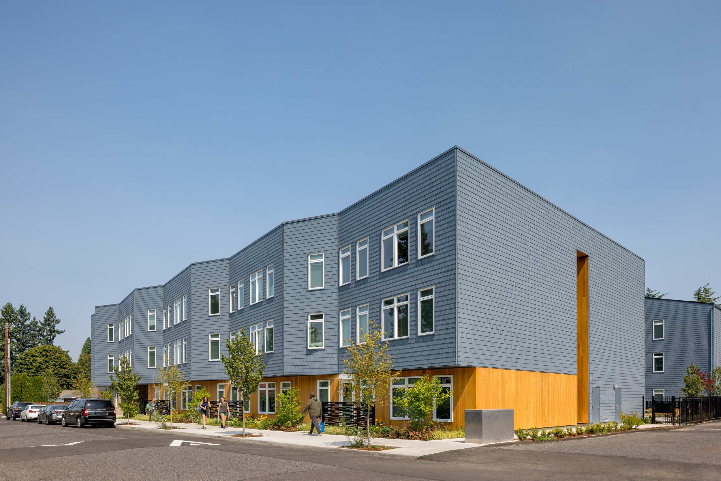
SEA’s design for Cedar Rising is responsive to the site’s atypical shape and is informed by its location within the neighborhood. Our team understood that to make the most use of the site, we would need to think about forms and massing creatively. To do this, the architecture shifted the C-shaped building’s forms to address property lines that are not parallel, and after these shifts, the entry form became the bridge between the two residential wings. The shifts also break up the overall mass and allow green space facing the residential community.
We oriented the building on the site so that the pedestrian entry is located on 174th Avenue, a commonly used walking path for public transportation and services. The parking lot is entered using SW Alexander Street, which is considered a community connector for vehicular traffic in Aloha.
The building’s exterior materiality is informed by the residential neighborhood. The first floor is a warm terracotta color with a brick-like texture that feels traditional and solid. The upper levels are a cream color with an ephemeral quality that changes throughout the day, creating a light and airy feel. The building’s perimeter is landscaped using drought-resistant plantings, offering a green buffer between the structure and the street.
The recessed entrance is a deep blue and calls to mind a front porch, welcoming residents home and visitors inside. When people enter they are greeted by a lobby, open mail center, and leasing office.
The community room is connected to the lobby and because of the deliberate transparency, the entry sequence is such that you can see from the entrance, through the lobby and community room, all the way to the outdoor courtyard. This transparency is trauma-informed and serves to create a sense of safety and community.
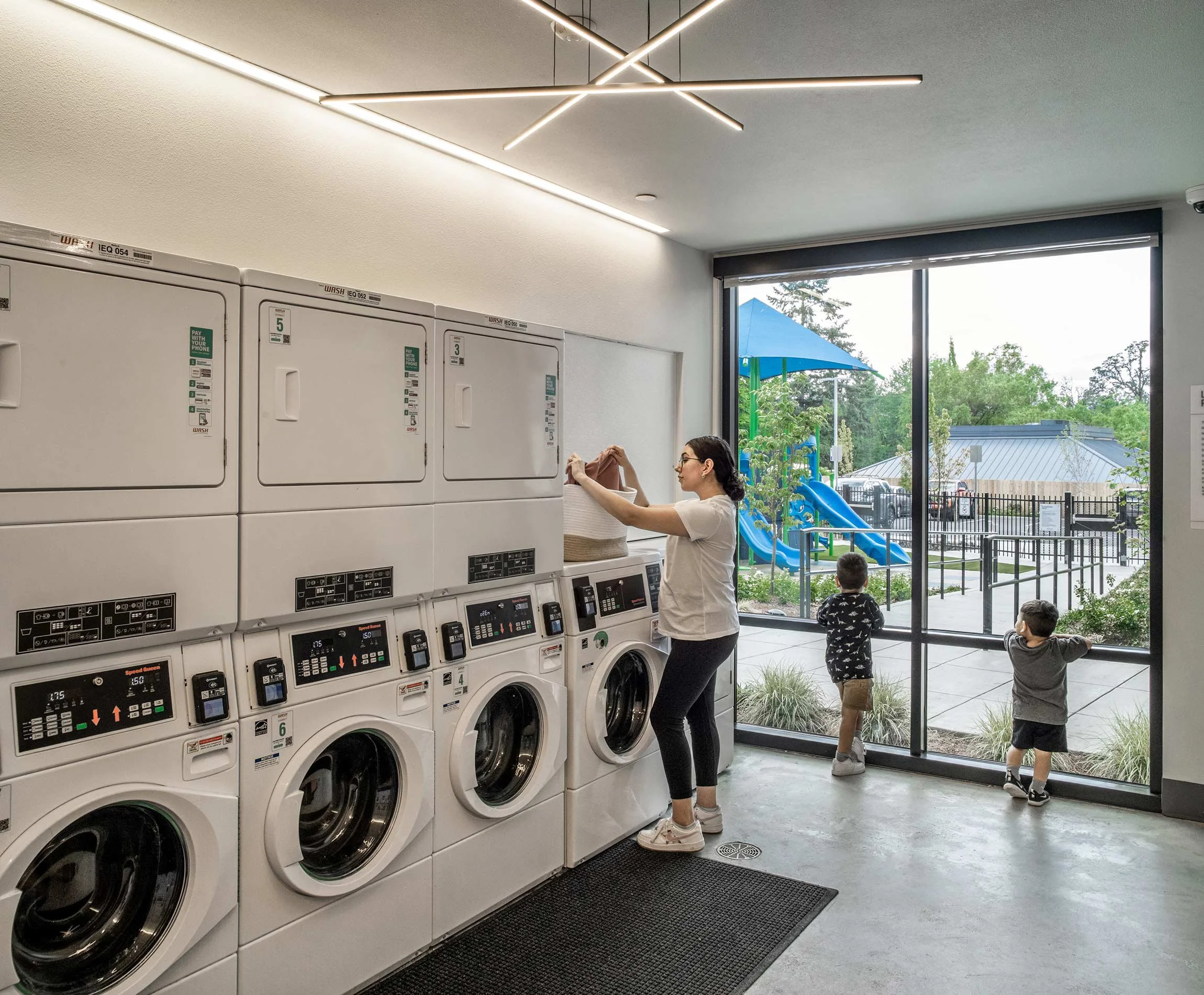
The interior is open, bright, and welcoming. The design’s shifting forms create a sense of movement in the building’s circulation and add individual identities to different areas. Elevator lobbies, the laundry room, and the ends of corridors have large windows to let natural light fill the space, ensuring even everyday experiences like walking from your front door to the elevator or doing laundry are in a comfortable daylit environment.
The resident courtyard features a playground, a BBQ, seating, and raised garden beds. The courtyard is also encircled by a low fence for child safety.
To help achieve Earth Advantage Platinum certification, sustainability features are implemented throughout the development. The roof is solar-installed, offering the potential to generate energy onsite. The building uses enhanced insulation, low-flow plumbing fixtures, low-VOC materials, and LED lighting. Each apartment also has increased ventilation to maintain the quality of air and promote resident wellness.
Acknowledgements
SEA Team
Lisa McClellan
Gillian Stoneback
Phil Viana
Megan McNeil
Matt Sedor
Project Team
LMC Construction
Interface Eng.
Stonewood Structural
Vega Eng.
MacDonald Env.
Photography Credits
Peter Eckert


