Salem Health Patient Tower Expansion
New patient tower positions hospital for the future
The Salem Hospital Building A patient tower expansion is a thoughtful and efficient addition to the active healthcare campus. Scott Edwards Architecture partnered with Salem Health to design the new 7-story tower in a way that worked within site constraints, streamlined circulation patterns, and could be built without interrupting activity. Architectural solutions such as a repositioned emergency department entrance and materiality that complements existing hospital buildings are responsive to current and anticipated needs, as was the decision to design the structure to a higher seismic standard than required. Each element contributes to a supportive and compassionate place for patients, staff, and visitors as they access and deliver crucial healthcare services.
Client
Salem Health
Location
Salem, OR
Size
203,000 sf
Year
2022
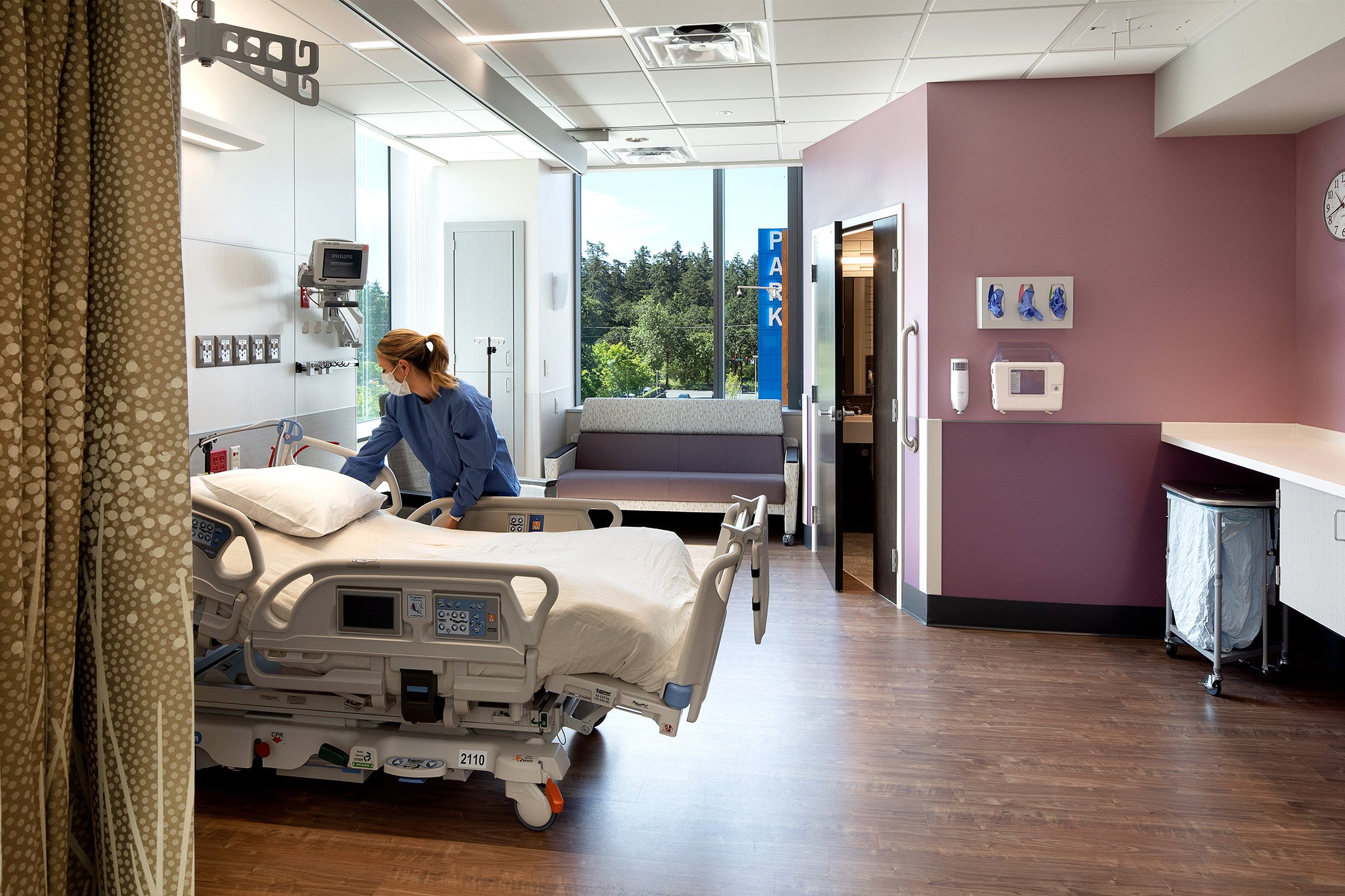
All 150 patient rooms are designed to be converted to critical care units, building future flexibility
The Building A patient tower expansion was driven by a growing need in the community for inpatient care. The programming and overall project vision were looking toward the future—an increasingly aging population, concerns about the Pacific Northwest’s seismic activity, and flexibility of spaces were all identified as important considerations. In response, SEA gathered and applied client and user feedback to create an efficient floorplan that incorporated the entire desired program, taking the initially anticipated 36,000 sf requirement and reducing it to 30,000 sf, a benefit to both the budget and the site constraints.
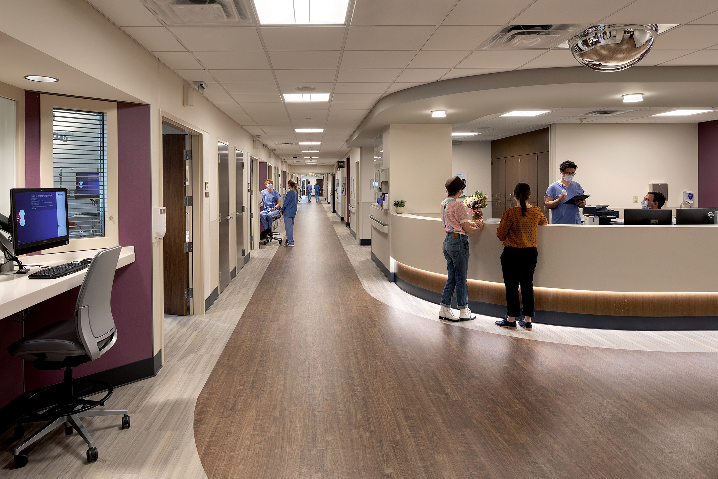
As part of our design, each floor features a different color of walls. The purpose of this is primarily as wayfinding—a quick visual cue to both patients and staff of which floor they’re on. In an expansive and active environment like a hospital, this can be a simple and effective way to help people orient themselves. The different colors also have the aesthetic benefit of adding interest and personality to the space.
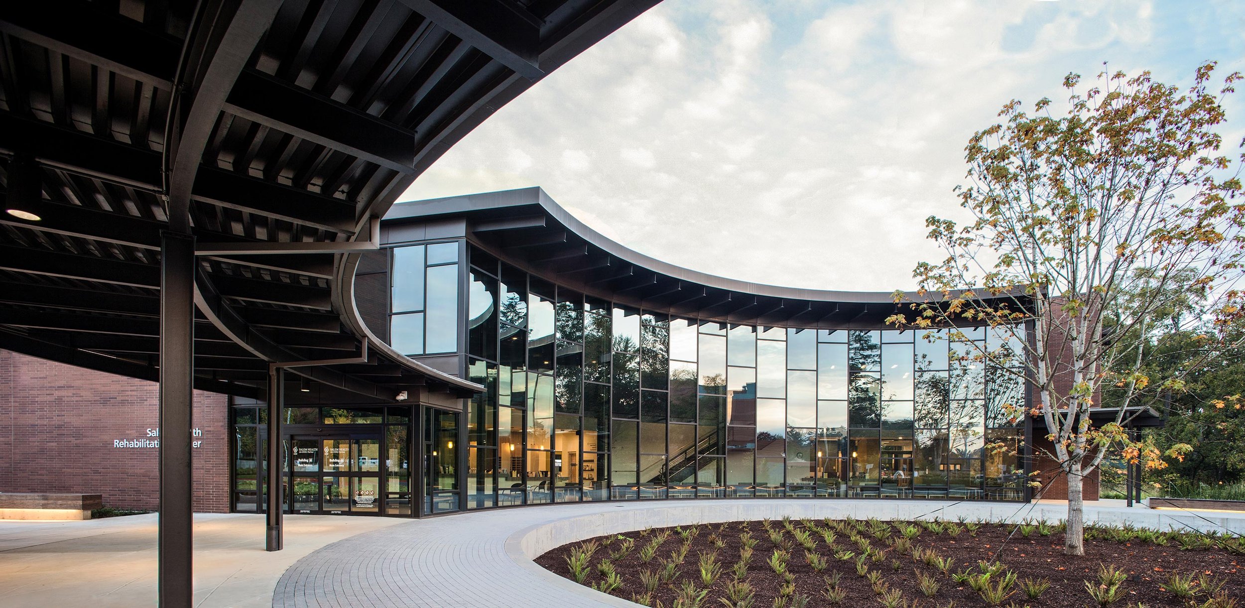
A non-denominational chapel offers a quiet, comfortable place for contemplation. The design includes several seating arrangements to support different types of gatherings and it connects to a landscaped chapel garden with a covered gazebo and a short walking path that moves through sculptural mirrors reflecting the plants.
The site constraints and the location of Building A within the campus posed several architectural opportunities, one significant example being the necessary relocation of the emergency department. The new patient tower would block the former emergency department entrance and as part of our design, we created an expansive new emergency drop-off by extending signage and architectural features out to the main road. This made the emergency entrance more accessible and visible than it was originally. We explore our approach to this in greater detail in our blog post, “Unhide your emergency department with site planning and design”.
To make the expansion more pedestrian-friendly, we rounded corners and eased transition points between the two buildings, improving the circulation of foot traffic.
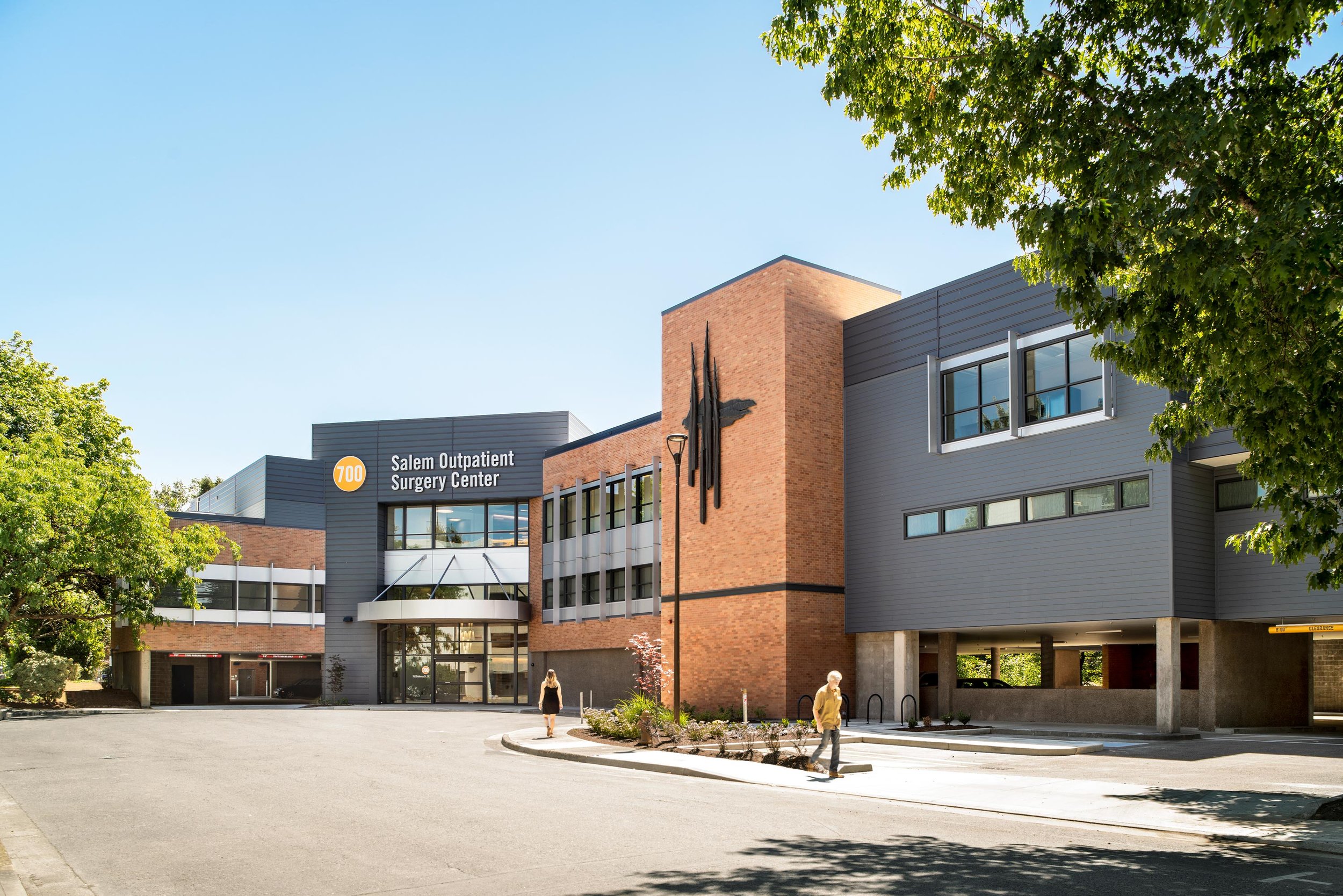
The new patient tower is a dynamic building that takes into account adjacent architecture and plays upon it. We took cues from the existing Building A and used similar materials found on campus, evolving them to provide an updated vision that can inform future growth. Our design uses an alternative stacked brick approach on the new expansion to provide interest and texture, using the same material but changing how it’s applied. We also use a metal panel color similar to that which is used by existing buildings on campus while simultaneously introducing a darker panel color in our design, expanding the palette with compatible options.
The Building A expansion is designed to meet Immediate Occupancy seismic standards, meaning it will not need to be completely replaced in the event of a catastrophic seismic event. SEA also provided design services for the adjacent parking garage. This portion of the project included seismic and deferred maintenance upgrades to the existing parking structure and the construction of new exterior architectural screening elements on the north and east façades that face the hospital campus.
The architectural elements include metal sails and battens to screen the garage and cars but allow light and views from the interior. The design also highlights the seismic upgrades that occur as steel brace frames are visible to the community. The entry canopies highlight and provide better wayfinding clarity for circulating in and out of the garage.
Acknowledgements
SEA Team
Alden Kasiewicz
Jill Arnold
Bryan Higgins
Jesse Graden
Andrew Smeby
Heather Flegel
Sara Ruzomberka
Susan Balogh
Lorelei Magee
Megan Schmitz
Eugenia Fama-Higgins
Rebecca Littman-Smith
Taka Mizutani
Murray Hawker
Project Team
Andiamo Consulting
Turner Construction
KPFF
PAE
HHPR
2.ink Studio
Photography Credits
Jeremy Bittermann
Flyworx


