Scott Edwards Architecture Headquarters
SEA grows in place, designs who we are
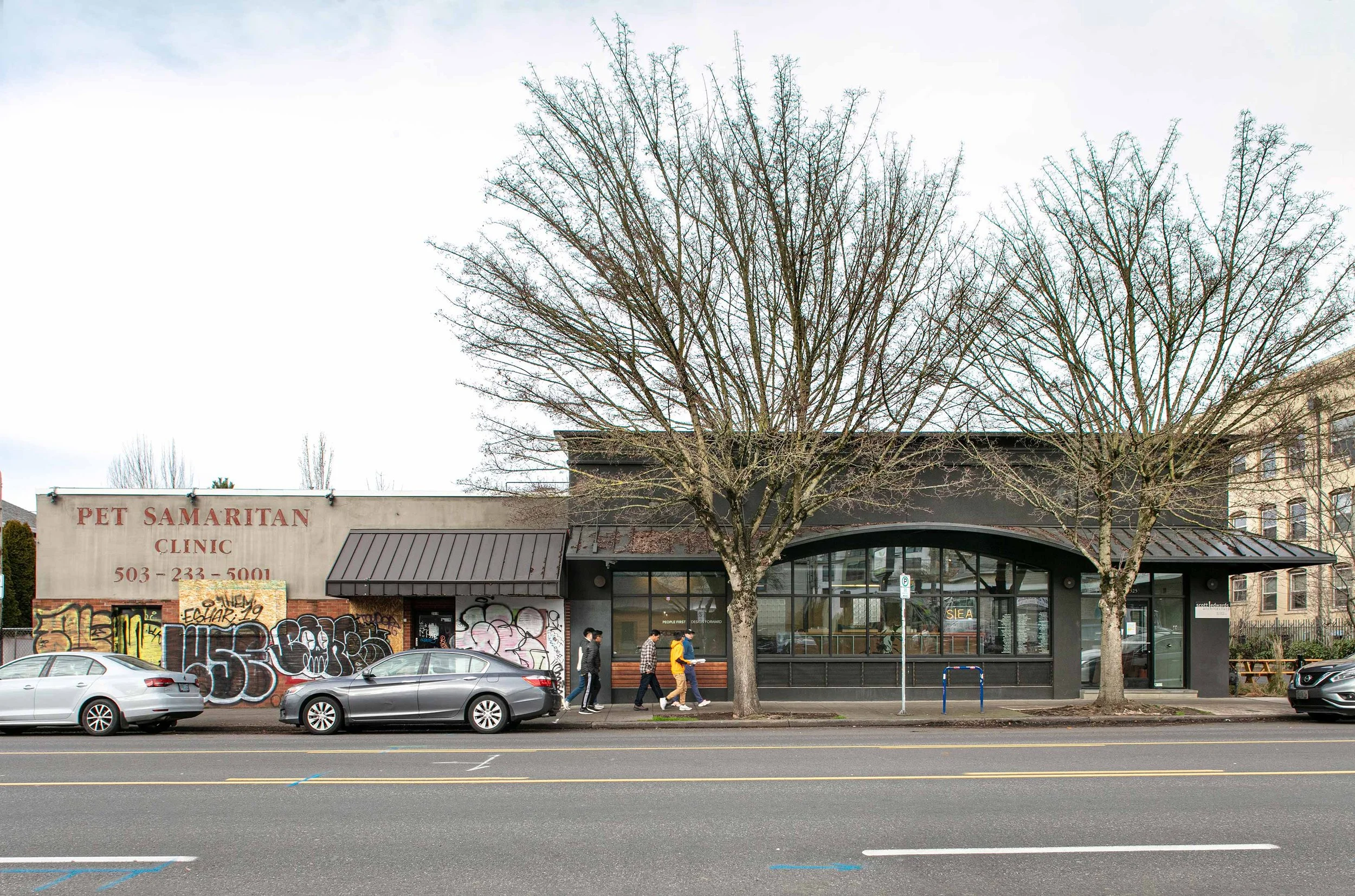
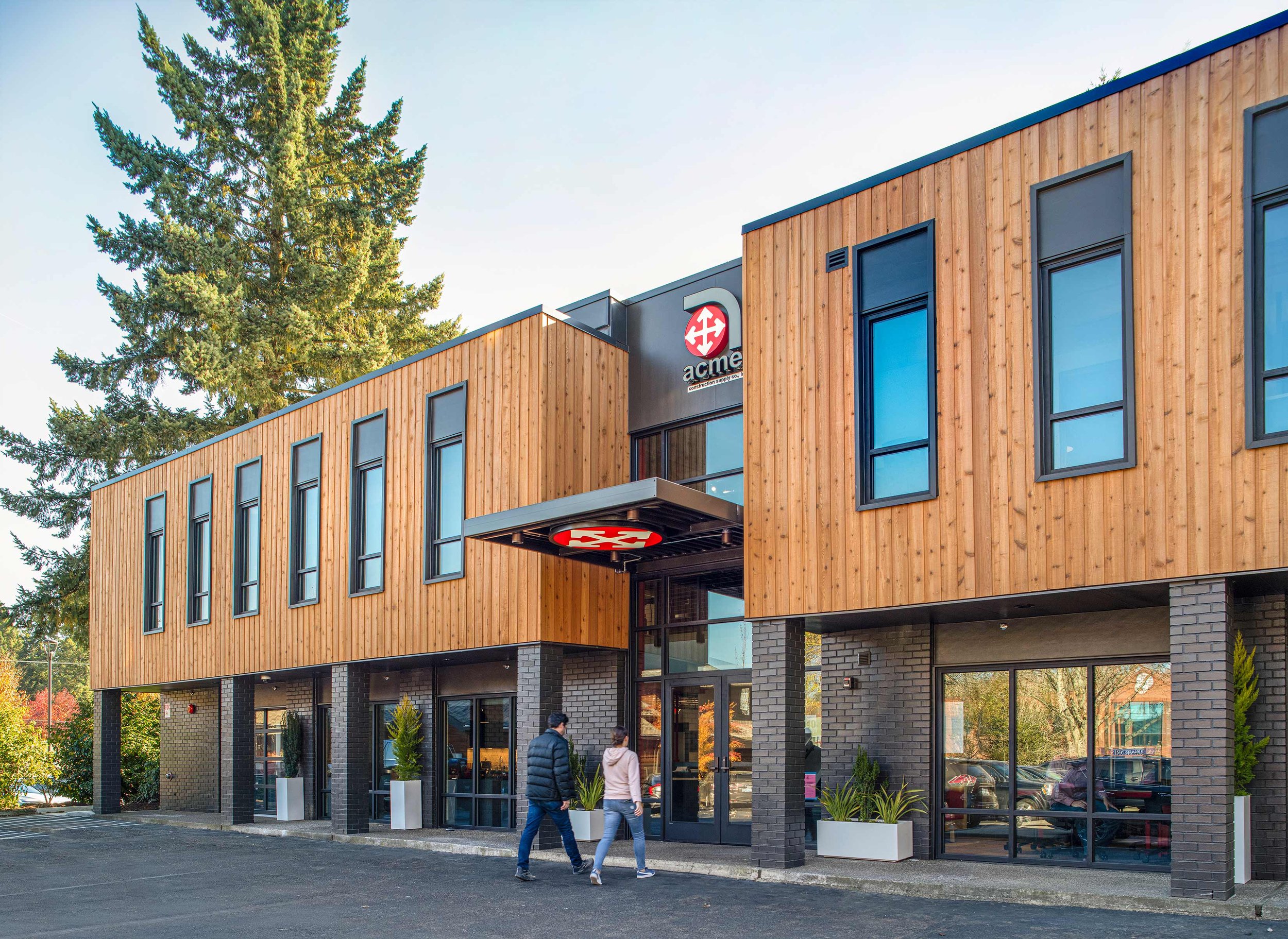
Scott Edwards Architecture’s headquarters renovation and addition is best described as an architectural laboratory, an exercise in knowing ourselves, and a labor of love. The work entailed a complete renovation of our existing building, a 3-story addition to the west, and an interior layout and design capturing our aesthetic and workflow. The building has a timeless design and integrates into the fabric of the neighborhood. The materials palette is understated but still impactful, and the exterior’s transparency connects the indoors and outdoors – staff can see outside to nature and passersby can experience what’s happening inside, offering a window into our process.
Client
Scott Edwards Architecture
Location
Portland, OR
Size
16,800 sf
Year
2021
Achievements
2022 DJC Top Project for Major Renovation Second Place
2022 AIA Oregon Merit Award
SEA’s team members were split between our Burnside location and our Ankeny location.
In 2016, it became apparent that we had outgrown our space. Although SEA had been rooted on East Burnside in the Kerns neighborhood for a decade, there was no reasonable way to add to our existing building. After an extensive citywide search for a new office headquarters, we narrowed it down to 3 locations. We were ready to make the move until we received a call that would change our trajectory – the next-door landowner asked if we would be interested in making an offer on their property.
Lukewarm at first, as we understood the complexities and expense involved with the type of project a renovation and vertical expansion would be, we quickly came to the realization that of course we should do this. We love our neighborhood and have invested so much of ourselves into the building and the community. This is SEA’s home. We also realized that our own HQ design was our best opportunity to use our collective experience as a vehicle to examine who we are as a company, how we got here, and most importantly, who we aspire to become.
Once SEA decided to stay, the process to renovate our existing office’s shell, and find a way to add additional office space vertically, began to unfold. We understood that our collective experience contained everything we needed to be successful, we just needed to tap into it. Early in the planning, we hosted an internal design charette before we launched into conceptual design. Suggestions for workstation designs, common space layout, furnishing ideas, material selection, and storage solutions informed our concepts.
“The Hole”
“Town Hall”
As we started design development, we saw how many of our initial staff suggestions uncovered further opportunities to rethink aspects of how we work. One example of this was our longstanding tradition of having large gatherings around a central light well in the middle of our existing office, known as “the hole”. As we examined “the hole’s” functionality, sometimes lacking depending on the context, we saw an opportunity to improve. SEA’s design flipped the gathering area’s spatial concept 180 degrees, filled in the hole, moved everyone out of the basement, and created a unified central gathering space. We’ve affectionately named it our “town hall” and it features bleacher seating, a 12-foot screen, and a top-of-the-line projector and audio system.
When choosing what materials to use for our own headquarters building, SEA landed decidedly on mass timber for several reasons. Our original HQ building was built in 1947 and uses bowstring trusses for the main structural supporting element.
We utilized mass timber in the 3-story addition to highlight a newer building technology and advancements in wood construction between the two buildings. Now one building, the two spaces tell a unified story.
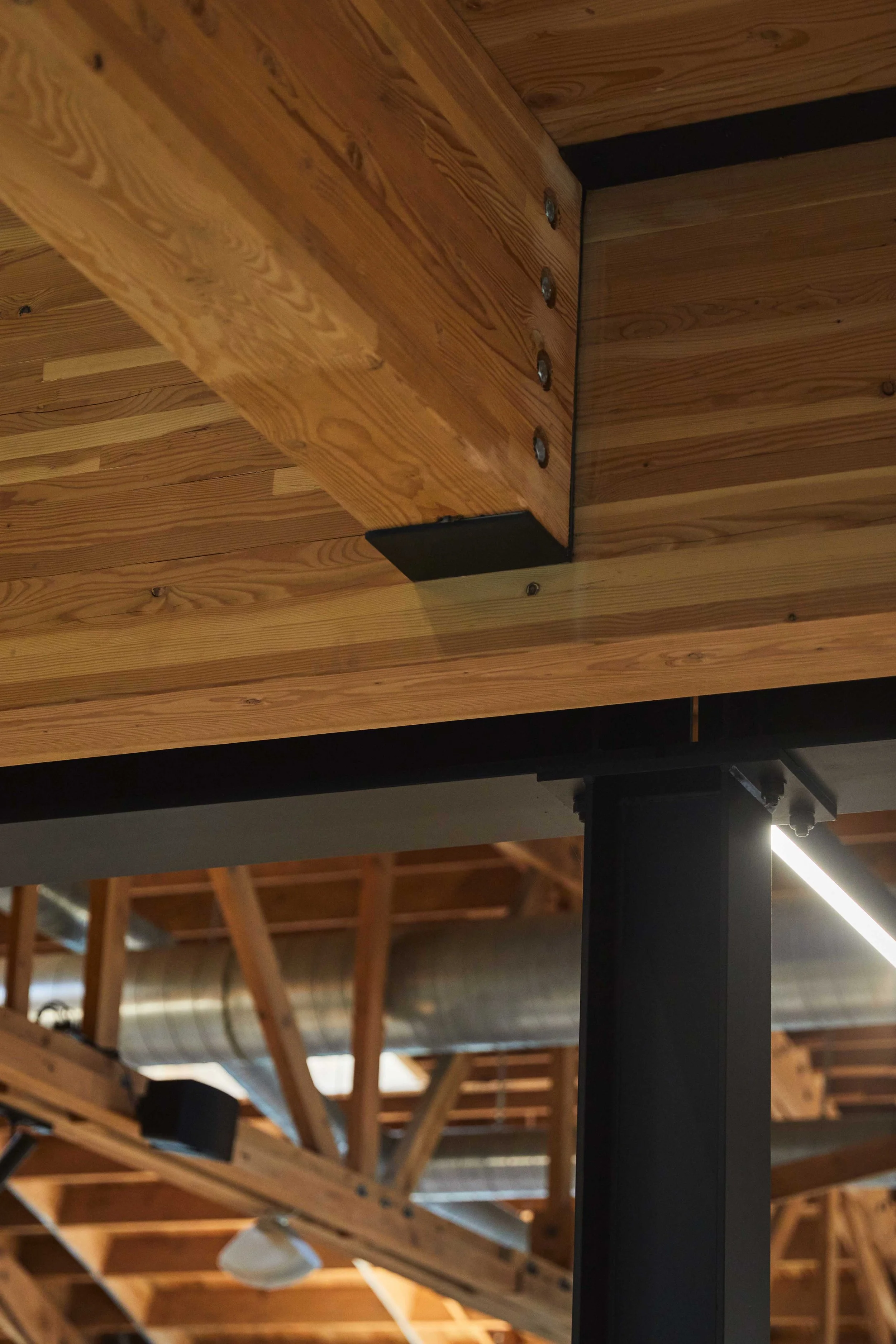
SEA also wanted to showcase mass timber for its aesthetic and functional value. We treated our HQ project as a lab where we could experiment with newer technologies in wood construction. We explored three different types of mass timber products: CLT, MPP, and NLT. We ultimately chose to use CLT for its flat-grained look, its benefits of carbon sequestration (from a sustainability standpoint), and its ability to be sourced in the region.
Make it stand out
Other strategies to increase sustainability included energy and daylight modeling to maximize comfort while lowering reliance on utilities. We ran a full lifecycle analysis on products and materials to learn their impacts and inform our decisions. SEA’s design also incorporates native landscaping, a green roof for stormwater management, water-efficient plumbing fixtures, and low-VOC building materials.
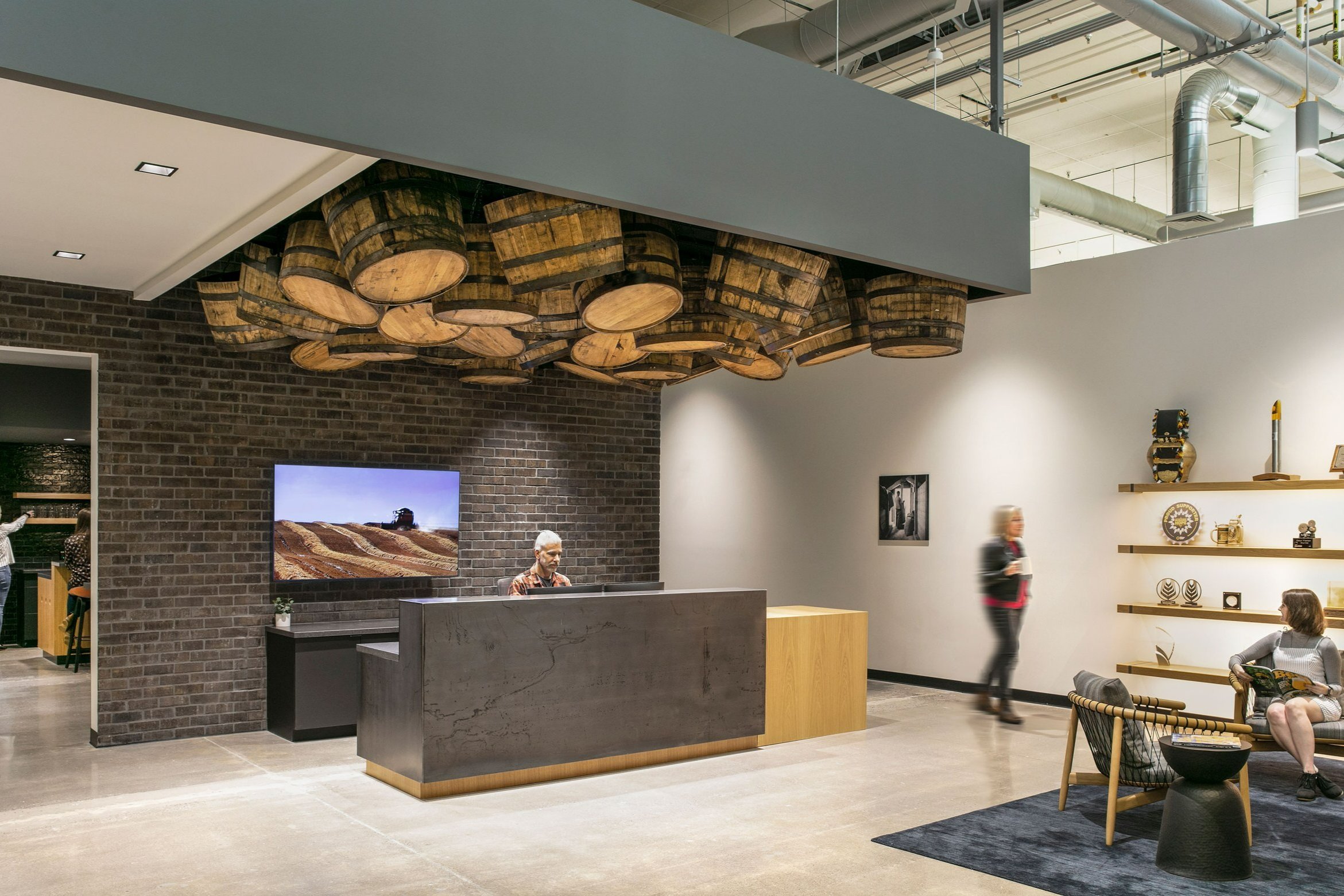
SEA’s Interiors team was charged with capturing our aesthetic, and in many ways, our firm’s personality. They built upon a warm industrial backdrop of wood, steel, and board form concrete (with some existing walls uncovered during demolition, much to our delight).
The Interiors approach aligns with the architectural approach – putting people first. Before mood boards and sketches came observation and interviews. We learned that SEA has a lot of staff chefs, which informed our kitchen layout. We also learned that we needed a mix of large and small conference rooms, informal meeting spaces, and places for focus.
HQ’s structure is hybrid and uses wood and steel. When designing, we explored implementing CLT beyond the primary use of a floor and roof system and found several ways to do so. The guardrail for the feature stair is made out of a single CLT panel turned on end.
Our observations also confirmed some things we already suspected, including that SEA has many ‘makers’. This collective interest in craftsmanship informed HQ’s interior materiality. We like raw materials and we like to see the structure. We seek out reclaimed objects and incorporate local pieces when possible.
We carefully considered each interior design choice. Natural light from many large windows fills the space and the open floor plan offers sightlines to the outdoors. The conference room carpet was selected because the pattern mimics light streaming through tree branches, which is a visual prompt scientifically proven to reduce stress.
The CLT canopy at the third-floor roof deck is an extension of the 3-ply CLT ceiling from the inside of the building and is cantilevered between 6’-10’. The load is carried above, allowing us to showcase the CLT running from inside to outside. The ceiling-to-canopy transition succeeds in connecting the indoors and outdoors fully by way of a large sliding glass door that opens to unite the two spaces.
SEA also created a freestanding “Spine” which makes up two open conference rooms and the reception desk. Shaped from CLT panels, it exists as a functional sculptural element in the office, visually connecting the CLT from the addition to the existing portion of the building while further supporting the project goal to facilitate collaboration amongst staff.
When we decided to embark upon this project as both architect and client, we understood that challenges would arise, but so would opportunities – we knew we’d have the chance to implement elements important to us, like sustainable features and mass timber, and benefit from them in our own space while also learning lessons applicable to future work. The result is a headquarters we are proud to work in and excited to share.
Acknowledgements
SEA Team
Peter Grimm
Rick Berry
Eric Wenzel
Jesse Graden
Ryan Yoshida
Rebecca Littman-Smith
Cameron Cruse
Jay Thornberry
Project Team
JHC Commercial
WDY, Inc.
Western Wood Structures
Interface Engineering
HHPR
Reppeto & Assoc.
PBS
Faster Permits
Code Unlimited
Photography Credits
Andrew Pogue
Noah Forbes
Peter Eckert


